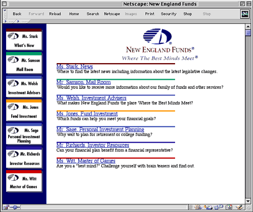
Figure 1 - New England Funds' new home page
In 1996 New England Funds was looking to brand themselves consistently across all mediums. At the same time, they had been receiving feedback that the company felt too impersonal to customers. A new marketing campaign was created, and their Web site was redesigned to reflect this new approach. The site was reorganized into sections, which better matched the information for which customers were looking. Information was restructured in several ways so that visitors could more easily find information they were looking for, no matter how they entered the site or which path they took. The information was broken into easily identifiable sections, and a fictitious name and personality associated with each section. Response times were reduced for e-mail received from the Web site. This helped visitors feel that there was a more human element to the site, and that people were continually present at New England Funds to help them with their needs. The result was increased hits to the site and greater customer satisfaction.
|
Figure 1 - New England Funds' new home page |
Fringe Elements | Fringe Benefits | Copyright Infringement | Lunatic Fringe